29 March 2016

Old VS New in Brooklyn

If I were to forever live in New York City, it would have to be in Brooklyn.  BK has the most interesting corners, and what is most unique is that quintessential New York Style mix of old and new.  I have immense admiration for those architects and designers that choose to embrace the history of older structures.

Elizabeth Roberts is definitely the expert in restoring incredible hidden treasures of such buildings. One prime example is this Williamsburg townhouse.  Look at this space -- no explanation needed.


Are you a fan of the New York Style?  Check out my pinterest board New York City Patina for more inspiration.


Interior Design and Architecture Elizabeth Roberts Design / Ensemble Architecture
Photography provided by Elizabeth Roberts for Remodelista


26 March 2016

Feels Like a Lazy Morning

It's Easter weekend and we are spending it in Vermont…  Let's just say it consists of lazy mornings.  Found this home that depicts just that very pleasant quiet feeling at this moment.


Coco Lapine Design via Stadshem
Photography Jonas Berg


22 March 2016

Spring is here!

Supposedly!   Snow hit the east coast Sunday night.  Luckily New York had nothing more than a slight dusting. But that doesn't stop us from spring dreaming!

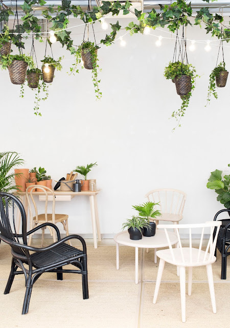
It is the time of year to indulge in vitality and seasonality in the IKEA stores ... so many exciting new products coming your way, IKEA ambassadors! The showroom solutions are shifting.  Our Scandi stylists are going wild.


One of my favorite Finnish stylists Maja of Musta Ovi inspired me with her latest work for Bo Helsinki.  It's rather funny how sometimes like minded people come up with the same ideas or solutions in different parts of the globe. 

Styling Maja


18 March 2016

Concrete + Raw

I swear,  my next house will be Brutalist concrete (part II).

So in love with the concrete corners of this Danish architectural beauty.


Source La maison d'Anna G. via Bo Bedre
Photography Jesper Ray


13 March 2016

Small Space Wonder

Josefin Hååg rings a bell, doesn't she?  If you are an avid fan of Scandinavian talent then you must be familiar with her work, as seen on 20 Kvadrat, Residencce Magazine, Fantastik Frank and many other projects alongside other incredible stylists.  I featured her flat once on Mad Studio Crush, because I just went mad, crazy about the clever and gorgeous one-room-living places I had ever laid eyes on.  What can I say, she has that perfect touch of minimal, warm, industrial, krisp.  You may have noticed her flat has been circulating on blog rolls again -- yep, you guessed it, it's for sale.


Found on A Merry Mishap
Styling Josefin Hååg
Photography Emily Laye


09 March 2016

STUVA for Adults

Who says STUVA storage is only for children?  Here shown in the artist, Helena Nord's studio, customised according to very specific needs.  Cabinets are anchored to the wall when stationary to meet safety,  which can be loosened and rolled carefully to another area of the studio.

Note: The artist stores nothing more than crafts for d.i.y. projects.  The unit is moved from one anchored spot to another, only to use the concrete walls as photography backdrop, and is not used as a mobile piece of furniture.


Livet Hemma
Styling Pella Hedeby
Photography Sara Medina Lind


08 March 2016

Achromatic Loft

Yes I admit, I have a lot of dreams.   No harm in dreaming,  right?  One of them is to live in an achromatuc and minimal loft. This Berlin loft pretty much sums it up.


Interior Design Annabelle Kutucu
Photography Claus Brechenmacher


04 March 2016

Art Wall/s

If you are like me,  living in a rental space in the heart of the city, you must own a little amount of furniture but own a lot of art.

This flat is a great example of well curated art peppered throughout the space without overwhelming the overall visual effect.  It is simple,  clean,  soothing.


SO SOFT SUNDAY via Alvhem


03 March 2016

Interior Tree

Greenthumb wishing one more time.   If I had a good source of sunlight in any corner of my New York flat - I would definitely have a tree.


Found on Coco Lapine Design
Styling Emma Fisher