30 September 2017

An Interior Designer's Home For Sale

Traveling for work has taken up most of my time lately, so forgive me for my absence. My search for inspiring images to share on here continues, and I'm happy to be back home and get back to it...

Wouldn't it be a dream to live in a designer's former home? Though we all have our own specific styles, their having lived in that house covers half of the work you need to do the space (if you even need to do anything to it at all). Elisabeth Heier's previous flat is now up for grabs and it truly is a dream. I wouldn't change a thing. Plus, it is located in my favorite area in Oslo - Grünerløkka.

View here for the ad of this home for sale.

Styling Elisabeth Heier
Photography Katerina Dima


14 September 2017

Apartments with utmost Sophistication

Being a fan of one of the best contemporary interior designers today, Lotta Agaton, it is never a surprise when she stirs up jaw-dropping new designs, especially when they are far from what initially grabbed me years passed. Her monochromatic interiors with black accents were my original love at first sight projects. But most recently her work has evolved into a more neutral palette with different wood stains from pale to shades of caramel. The sophistication is endless.

Her latest work consists of city dwellings with contemporary, minimal design with utmost sophistication. Think luxury but with warmth.


Source Residence Magazine
Design + Concept Lotta Agaton for Patriam 
Architecture Samrén + Månsson


09 September 2017

Mono Greys and Natural Wood

The IKEA EKEBOL double-duty sofa looking its best in this styling job by Swedish stylist Pella Hedeby. The soft flax-coloured linens, plywood and monochromatic dark greys are stunning together. I love it when ALEX drawers create a bank of low surface like a classic credenza. So many ideas in so little space!


ELLE Decoration
Styling Pella Hedeby for IKEA Finland


07 September 2017

Historic vs. Contemporary

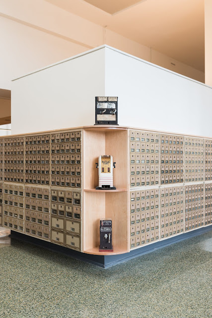
What is more painful than tearing down a historic piece of art such as a community building that was in function for generations? So why not restore it back its old glory and combine it with modern age materials and finishes? One perfect example is this dilapidated 80 year old post office building in Richmond, VA that was transformed to a new digital agency, Mobelux.


It is important for the original bones to be intact. But as time flew by, even the sturdy buildings begin to crumble. Complete restoration of architectural details was the main attention during its renovation, while contemporary touches were added to a bare minimum, keeping lines simple and modern so as to not lose the wonderful history this building offered its community through the decades. Trademark pieces from Herman Miller were the perfect choices, giving a classic 20th century look, and giving tribute to the old industrial era. Original P.O. boxes are kept in certain areas, as well as terazzo flooring throughout. Light fixtures by Schoolhouse Electric adds that special institutional touch. Vintage equipment gives this structure a museum-like atmosphere, bur also adds the quirky personality of its new creative crew.

The basement grounds offered a wind-down station for Mobelux employees, as well as quiet corners for the creative minds. This is by far a dream office, if you ask me. 

Photography Ethan Hickerson


02 September 2017

Roommates' Paradise Loft in Berlin

Certainly everybody has horror stories about roommates from hell. Often it is because of lack of space, lack of storage, or simply lack of personality. In Berlin, 3 friends share a renovated unit wherein two apartments were combined into one lofty space but split into 3 levels. Generous areas make this a very livable space, allowing portions for togetherness. Its uncluttered, minimal space will force anyone to live with less. The design itself is such a work of art by llot llov, it's like living inside your own gallery...


Via Flodeau
Design llot llov
Location Berlin Wins Quarter


01 September 2017

IKEA x HAY II

I'm sure everyone is giddy over this IKEA collaboration with HAY. Well, it's now here and I think I'm creating a new wish list.


Click here for photos from the Hay launch.


IKEA Livet Hemma
Styling Pella Hedeby + Anna Lenskog Belfrage
Photography Kristofer Johnsson


IKEA x HAY II  |  K R i S P I N T E R I Ö R