What is more painful than tearing down a historic piece of art such
as a community building that was in function for generations? So why not
restore it back its old glory and combine it with modern age materials
and finishes? One perfect example is this dilapidated 80 year old post
office building in Richmond, VA that was transformed to a new digital
agency, Mobelux.
It
is important for the original bones to be intact. But as time flew by,
even the sturdy buildings begin to crumble. Complete restoration of
architectural details was the main attention during its renovation,
while contemporary touches were added to a bare minimum, keeping lines
simple and modern so as to not lose the wonderful history this building
offered its community through the decades. Trademark pieces from Herman
Miller were the perfect choices, giving a classic 20th century look, and
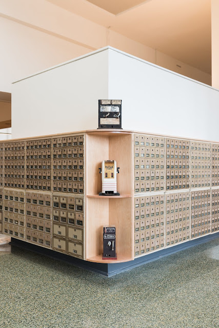
giving tribute to the old industrial era. Original P.O. boxes are kept
in certain areas, as well as terazzo flooring throughout. Light fixtures
by Schoolhouse Electric adds that special institutional touch. Vintage
equipment gives this structure a museum-like atmosphere, bur also adds the quirky personality of its new creative crew.
The
basement grounds offered a wind-down station for Mobelux employees, as
well as quiet corners for the creative minds. This is by far a dream
office, if you ask me.
Design BOB Arcitecture
Photography Ethan Hickerson


No comments:
Post a Comment
So what do you think? Please share...