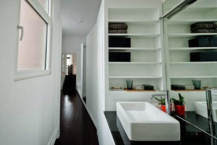
Graphic designer Davy Dooms created the perfect spot in Antwerp based on a perfect poster. Nothing but clean, sharp lines with touches of organic colour and shapes. Working with a base of black and white he chose to use orange for a pop of bright and the warm shades of Midcentury woods, marrying Scandinavian with American Midcentury.
Photography Niko Caignie


No comments:
Post a Comment
So what do you think? Please share...