30 October 2016

Rustic Retreat

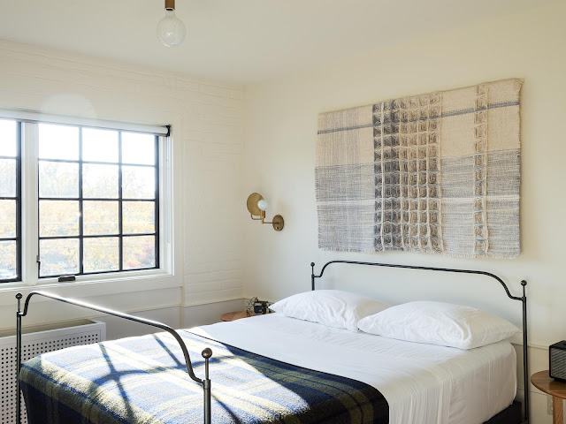
The dream is to have your own little hideaway from the urban jungle at least once a week, right? You don't need a large space. Instead you simply need a quiet retreat that has nothing but the sounds of nature with the sunlight beaming through the windows on those cool mornings. Simply put -- a place to unwind and enjoy the solitude.

This 728 square foot home is exactly that. It is modern and minimal, with warm, rustic textures to make you feel fuzzy all over. That sliding barn door made me fall off my chair when I stumbled on these snaps. Can you imagine yourself waking up to all this on a Sunday morning? I am so wrapped up on this instagram feed, you have no idea.


Dwell via Country Road Living
Photography Angie Wendricks


29 October 2016

Rivertown Lodge | Hudson NY

Workstead is a NY based company I've admired since their beginning days of lighting design. Focus on them began during the explosion of industrial themes in interiors and commercial establishments. Their hotel portfolio is impressive, and their residential work is an equal, desirable match.

My recent trip to Los Angeles explains my lack of posts. And frankly since there is a life-changing decision that will take place in the next month, my inspiration has drawn me to companies like Workstead -- dreaming of future digs… My last few weeks here in NY will make me miss such places like Hudson Valley. Workstead designed Rivertown Lodge using their signature aesthetic of internal windows/door screens (of which I am a dying fan). Their wall panelling as well is something to covet. Always sticking to their classic touch but without losing warm, minimal modernism. Certainly wishing to stay in this lodge before I bid New York goodbye.


Workstead
Brooklyn NY Design Firm


23 October 2016

The Parachute Hotel

Been spending time in Los Angeles the past week. California dreaming here to the max. Just simply enjoying the weather, the outdoors, the gorgeous succulents. Not to mention the architecture that is sprinkled throughout, from typical California tiled roofs, Spanish accents, to ultra modern concrete and metal homes. Venice Beach took me by surprise with the rows and rows of beautiful digs...think Californication. Some hotels and establishments have that quintessential California vibe. I truly dig the Scandinavian influence in this district.

Parachute Hotel is one place I'd choose to stay one day. Looove the furnishings, textures, and overall feel of it. And yes, they have a shop too!


538 Rose Avenue
Venice, CA

 The Parachute Hotel Showroom Store


20 October 2016

Trending | Tina Hellberg for IKEA

Stylist Tina Hellberg forecasts the new trend on soft industrial for IKEA. Graphic patterns, raw, home made, and mixed with soft industrial.


Josefin Hååg via IKEA
Styling Tina Hellberg
Photography Andrea Papini


19 October 2016

Lotta Agaton's Home

Can't think of a better photographer to capture the essence of Lotta Agaton's home better than Pia Ulin.  Lotta's style has always been a true love of mine. The rough textures, monochromatic tone-on-tone schemes, as well as dark and moody shadows and natural lighting (this new home contrasts her previous digs of a strong white expression). Pia Ulin's photography resonates with Lotta's interior styling so much that they are a match made in heaven. Both talents remain consistent in their work, and together they create an explosion of inspiration.


Pia Ulin and Lotta Agaton's combined work has been highlighted previously on KRiPINTERIÖR on this post.  Pia Ulin's Brooklyn home was also featured here. Clearly two peas in a pod, that Pia's photos hang in Lotta's bedroom...

Interior Styling Lotta Agaton
Photography Pia Ulin


18 October 2016

Small Swedish Apartment in Neutral Shades

All you city dwellers out there know the value of having a cohesive palette in a small flat. The continuous flow from small room to small room just leads you to believe it is one delicious space. Of course one must own only but a few must haves and a statement piece here and there. Art as well is very important to hype up personality (and easy to transport when you move). But generally, the more minimal your approach the more cleansing and soothing your home environs become.

One look at these chrome and leather accent chairs and I was immediately swooned by this space. The different shades of beige fill it with cozy textures. Even the Smeg fridge adds to the overall visual harmony.


Stadshem
Photography Jonas Berg


Small Apartment in Neutral Shades |  K R i S P I N T E R I Ö R


15 October 2016

Dream Office for Creatives

Nicole Hollis is a design firm based in San Francisco with a dream office studio for anyone with a creative passion. This office hits the wish list from the minimalist reception area all the way to a staff dining room. The design is so impeccable anyone could use these ideas in a home, if you favor those re-purposed industrial buildings (like me!), that is. The colour palette is swoon-worthy. And that black kitchen is to-die for.


I must say my favorite room has to be the creative studio, pictured above. Keeping all resources intact, filed and organized in a library with communal bar counters to spread all the design materials. Current projects are filed and segregated in architectural tray drawers. Ohhh, it's a dream!

Source Remodelista
Design and Architecture NICOLEHOLLIS
Photography Loire Joliet


Patricia Urquiola for Mutina

Usually when it comes to tiles I gravitate to a more classic, less fussy, or even plain, but with interesting textures. Or sometimes I can go all-out and have patterned Spanish cement tiles in an otherwise minimalist interior architecture.  But when I saw Patricia Urquiola's collaboration with Matina, I was immediately drawn to it. Some of her cement tile designs have been around for some time and perhaps considered a classic in itself, but her new collections are growing. It is impressive and has delectable colour palettes.


View more of Patricia Urquiola's Mutina portfolio here.