31 March 2017

An Escape to the French Mediterranean

The weather has been gorgeous here on the West Coast. Needless to say, the inspiration for exterior spaces are bountiful. And with the countdown of my tropical vacation I am beyond exhilarated! My swimsuit has arrived in the mail and my packing list has begun. Visions of the Mediterranean continue to haunt me... Oh how I miss the Santorini skies and blue seas. I will be on the other side of the world this time around, but that doesn't stop me from dreaming.

This beautiful spot on the French Mediterranean is designed by a young architectural duo Humber and Poyet. Though they are known for their high end design and luxury, this particular getaway place is perfect for those turquoise waters. Rustic and casual, and yet meeting the simple but elegant touches such as brass fixtures. Ahh, take me there now...


Architecture Humber and Poyet


 An Escape to the French Mediterranean |  K R i S P I N T E R I Ö R


29 March 2017

One Pic Wonder


 My mind has been a spinning wheel recently. Living in California has given our lives new meaning, and a new love for the outdoors unforeseen. Oh yes, a brand new life indeed (coming from a very exciting and cramped concrete landscape of New York City to now green walks on mountains and trails). Our bedroom has a balcony that have yet to be furnished so inspiration is constant and store visits have been frequent in search for the perfect outdoor solution.  I keep going back and forth and what suits us best. And truly, simpler is better... I am quite drawn to this simple and inviting little set-up. Now I'm REALLY excited.

Residence Magazine
Photo Designmag.fr


15 March 2017

The Ideal Bunk

Children's rooms are often a challenge. Is there a way to make it look sophisticated and yet not losing the essence of being child-like and still be filled with room for fantasy, imagination and function? Why, yes! One of the most sought-after group of designers did the perfect job in customizing an efficient and inspiring modern bunks-- Workstead.


Every little nook and cranny is a spot for storage. And those bunks can make a child's imagination run wild with a construction imitating a tiny house. The room design also offers a wide span of free floor space to roam and play, as well as built-in storage and desk area for study.

The space embraces the architecture of narrow New York City spaces. The high ceilings allow natural light to flood through large windows and a transom above the bedroom door.

Workstead is a fast-growing company with utmost quality in craftsmanship and aesthetic. I must say they are one of my favorite design firms. Workstead was previously featured on KRiSPINTERIÖR for their work on both hotel design, as well as residential in and around NYC, shown here, here and here.

Source Remodelista via Workstead
Interior Design Workstead 
Photography Matthew Williams


13 March 2017

The Attic Apartment

I have many, many dream apartments. One of them is living in an attic, with all the rough textures, trusses and walls intact.


Oracle Fox


The Attic Apartment | K R i S P I N T E R I Ö R


12 March 2017

Dream Little Bedroom

I wouldn't mind an open concept bedroom with a dream closet... This only works with a well-edited, well curated minimalist wardrobe, of course. Are you one of those people? Then this inspiration is for you.


CLD via Alvhem
Styling Sarah Widman


11 March 2017

Grey Kitchen

Minna Jones has the perfect little grey kitchen...


The kitchen is designed by Minna Jones herself, and finished it off with the perfect shade of grey by Teknos NCS S -6502 -Y.  Accessorized with products by IKEA, Marimekko, Frama, Menu and Lampe Gras.

Minna as one of my old school favorite stylists dating back to Scandinavian Deko days. She and her different homes have been featured several times on KRiSPINTERIOR, but my favorites are her spring inspired photos shown here and here.

MINNA JONES  


06 March 2017

Compact Farmhouse Kitchen

It is surprising sometimes to see a farmhouse kitchen that is teeny tiny. An old property often has decades old structures that seem unforgivable to the modern eye. But really, all it takes is a little imagination. Take this ol' country kitchen...


Fantastic Frank


05 March 2017

KUNGSBACKA Black Kitchen

You know me and my obsession with either black or white kitchens. Well here it is for fans of the black kitchen door fronts! The new KUNGSBACKA kitchen door in IKEA shown here as a compact kitchen, matched with FINNTORP rail system.


Stil Inspiration via IKEA Livet Hemma
Styling Pella Hedeby
Photography Ragnar Ómarsson


03 March 2017

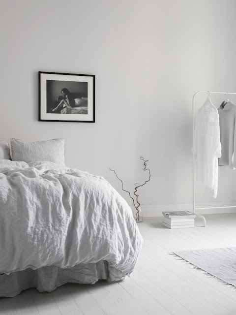
Bedroom Inspo

Going through the motions of moving to an opposite coast has been an immense challenge. Learning to edit and evaluate one's life and possessions is a true test of "where do we go from here?" It has taken some time to get our feet wet in the new digs, but I've discovered wanting different things. One of them is to truly live minimally, own less, and surround myself with essentials. A few luxuries are ok, but there's no need to overdo it.

The bedroom is one place I truly feel should remain a sanctuary. Clutter-free, calm, and dreamy. Japanese minimalism has been my main inspiration to date. I looked no further than Sara Medina Lind, one of my favorite photographers.


Sara Medina Lind has been featured on KRiSPINTERIÖR seen here and here, and most recently here. But I warn you -- you might just get hooked on her portfolio!

Sara Medina Lind